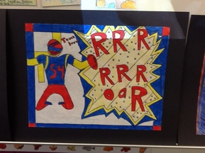
This is my Onomatopoeia pop art and we could only use the colors black, white, yellow, blue, red I learned how I can make words pop more so it catches the viewer or audience. As you can see in the picture I have only used those colors and I have made the words pop also, I learned how to draw a little better. Next time I create it I could have made it look a little neater and maybe add more detail. I colored it deeply which I think I did good on and also I think the design is pretty good.
 RSS Feed